United Way
Lubbock Area United Way
Case Study
I designed Lubbock Area United Way to optimize user experience through simplified navigation. I focused on three primary target audiences: people seeking help, volunteers, and donors. Learn more about the strategy I implemented by viewing my case study.
Company Background and History
United Way is a nationwide non-profit that provides people of all backgrounds with the resources they need to overcome economic barriers. They focus on providing safety, educational, financial, and healthcare resources across communities, while finding volunteers and donors to make their mission possible. United Way has multiple branches, including a branch in Lubbock, Texas: the location that I worked on.
Objectives
Lubbock Area United Way wanted to refresh their site while giving it a user-friendly layout for donors, volunteers, and individuals seeking help. Additionally, they wanted to ensure that their 211 hotline was easy to find.
Implementation
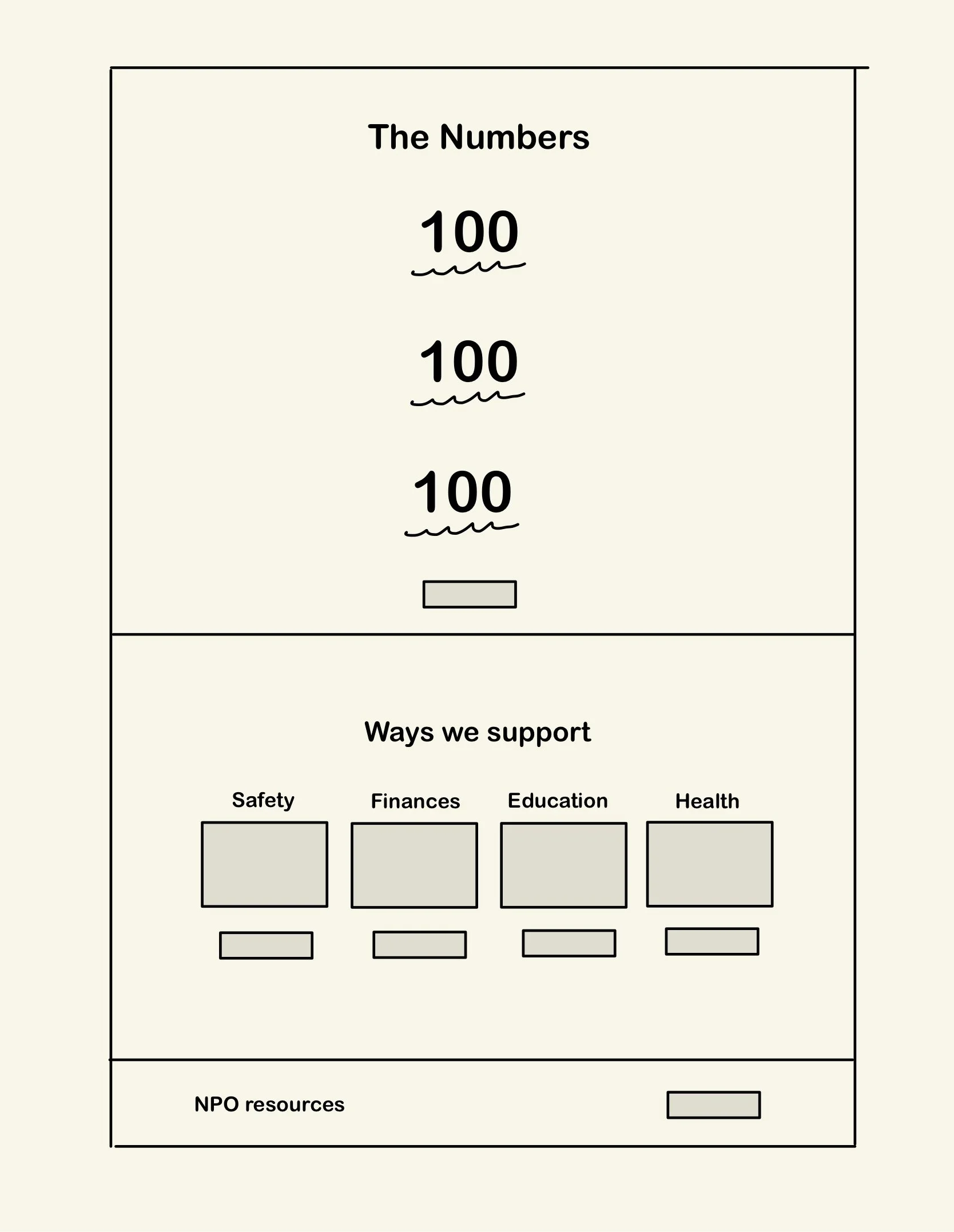
Before starting each page, I made wireframe sketches to decide the overall layout and feel of the website. Each page has specific information, links, and data needed to convey United Way’s goals and impact, so I challenged myself to relay the information as directly as possible. United Way Worldwide requires each branch to follow their guidelines, so I implemented their fonts, brand colors, logos, and phrasing to ensure that their brand identity is cohesive.
Specific Actions Taken:
Followed United Way guidelines to ensure brand cohesiveness.
Refreshed design for a user friendly experience.
Linked the 211 hotline to the header for easy access.
Utilized a landing page format to direct users to the pages most relevant to them.
Highlighted the client’s various roles through copywriting
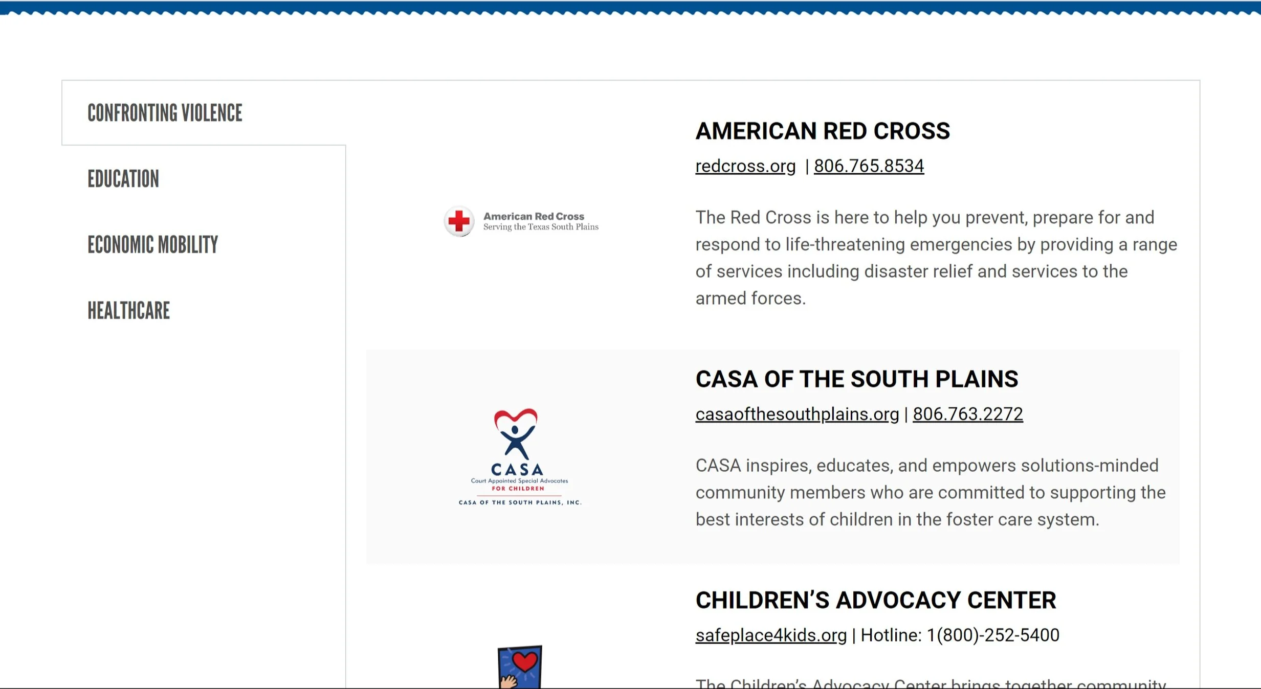
Recognized community partners across the site to highlight their programs.
Used language at a 3rd grade reading level to ensure accessibility.
Visuals
Prototyping
Results


